- Format
- Häftad (Paperback)
- Språk
- Engelska
- Antal sidor
- 305
- Utgivningsdatum
- 2012-04-13
- Förlag
- PACKT PUBLISHING
- Illustrationer
- black & white illustrations
- Dimensioner
- 235 x 190 x 20 mm
- Vikt
- Antal komponenter
- 1
- Komponenter
- Paperback
- ISBN
- 9781849693189
- 560 g
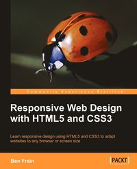
Responsive Web Design with HTML5 and CSS3
Learn Responsive Design Using Html5 and Css3 to Adapt Websites to Any Browser or Screen Size
- Skickas från oss inom 7-10 vardagar.
- Fri frakt över 249 kr för privatkunder i Sverige.
Passar bra ihop
De som köpt den här boken har ofta också köpt Co-Intelligence av Ethan Mollick (häftad).
Köp båda 2 för 703 krKundrecensioner
Fler böcker av Ben Frain
-
Responsive Web Design with HTML5 and CSS
Ben Frain
-
Sass and Compass for Designers
Ben Frain
-
HTML5 and CSS3: Building Responsive Websites
Thoriq Firdaus, Ben Frain, Benjamin Lagrone
-
Enduring CSS
Ben Frain
Övrig information
Ben Frain has been a freelance front-end web designer/developer for over a decade working directly with clients and alongside design agencies worldwide. He also works as a technology journalist, contributing regularly to a number of diverse publications on the Mac platform, future technology, website design and technology systems. Before that, he worked as an underrated (and modest) TV actor, having graduated from Salford University with a degree in Media and Performance. He has written four equally underrated (his opinion) screenplays and still harbors the (fading) belief he might sell one. Outside of work he enjoys playing indoor football whilst his body (and wife) still allow it. Visit him online at http://www.benfrain.com and follow him on Twitter at twitter.com/benfrain
Innehållsförteckning
Preface
Chapter 1: Getting Started with HTML5, CSS3, and Responsive Web Design
Chapter 2: Media Queries: Supporting Differing Viewports
Chapter 3: Embracing Fluid Layouts
Chapter 4: HTML5 for Responsive Designs
Chapter 5: CSS3: Selectors, Typography, and Color Modes
Chapter 6: Stunning Aesthetics with CSS3
Chapter 7: CSS3 Transitions, Transformations, and Animations
Chapter 8: Conquer Forms with HTML5 and CSS3
Chapter 9: Solving Cross-browser Responsive Challenges
Index


