Kim Marriott – författare
Visar alla böcker från författaren Kim Marriott. Handla med fri frakt och snabb leverans.
11 produkter
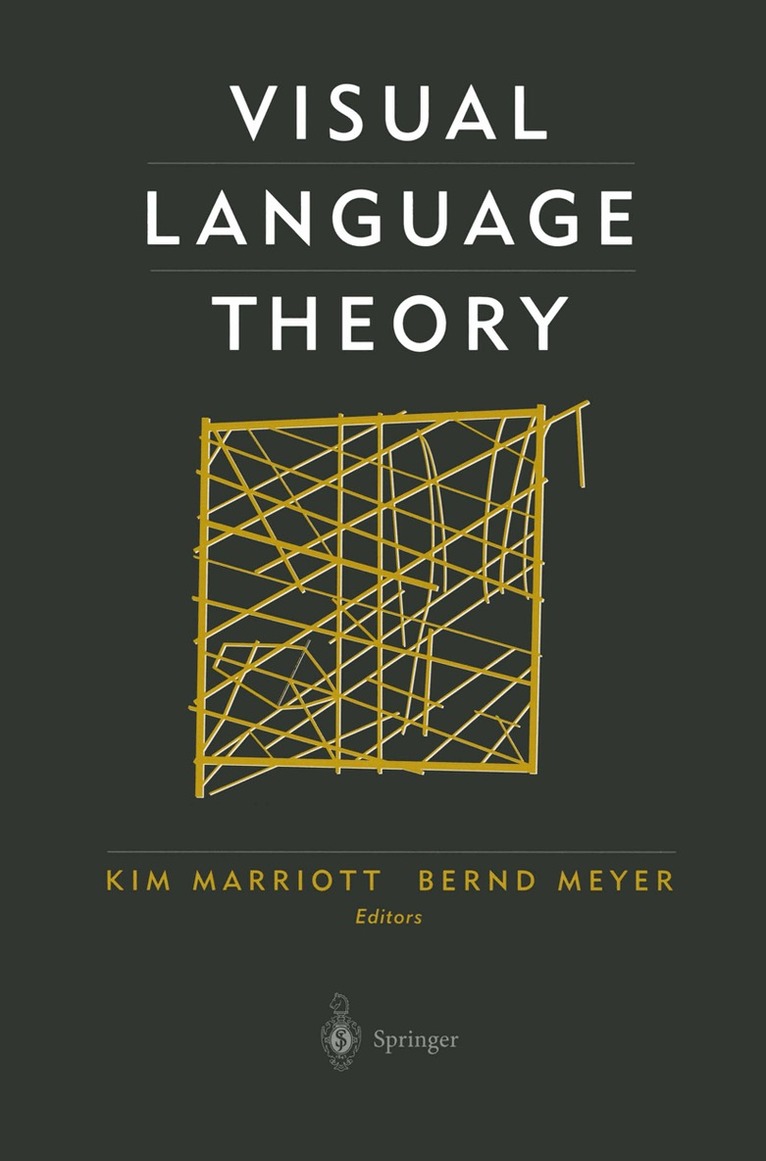
Visual Language Theory
Av Workshop on Theory of Visual Languages, Kim Marriott m. fl.
Inbunden, 1998
1129 kr
Lägg i varukorg
Kim Marriott Bernd Meyer Communication is one of the hallmarks of humans. When we think of hu man communication, most people first think of spoken and written lan guages. These are similar in that symbols in the language are encountered and processed sequentially, either temporally as they are …
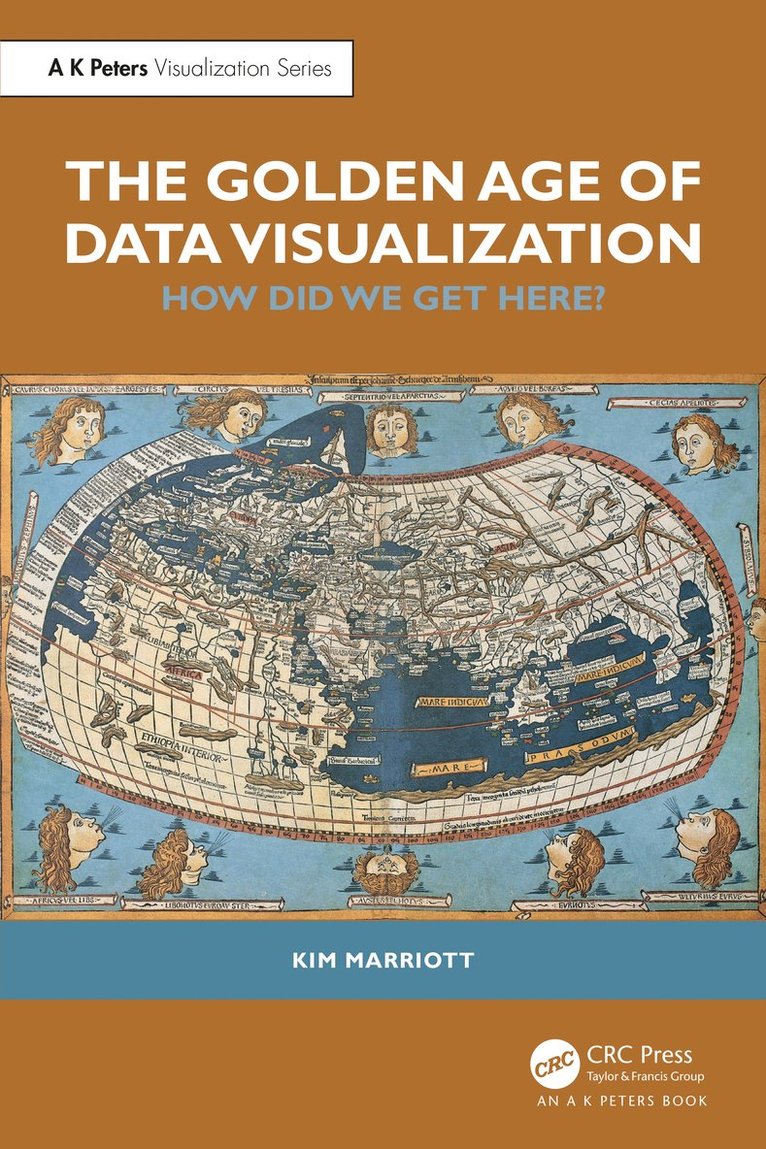
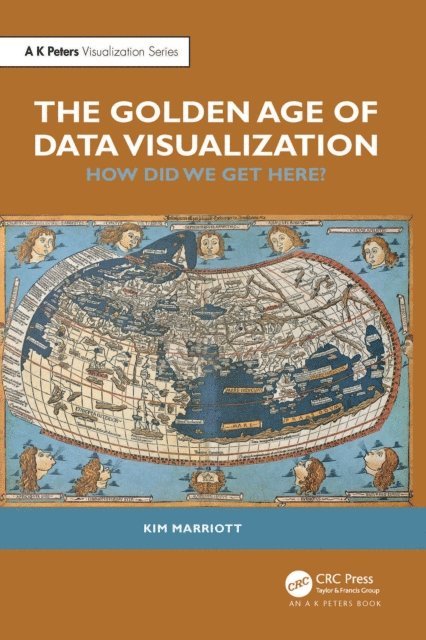
Golden Age of Data Visualization
How Did We Get Here?
Av Kim Marriott
Häftad, 2024
818 kr
Lägg i varukorg
We are living in the Golden Age of Data Visualization. The COVID-19 pandemic has demonstrated how we increasingly use data visualizations to make sense of the world. Business analysts fill their presentations with charts, journalists use infographics to engage their readers, we rely on the dials …
Golden Age of Data Visualization
How Did We Get Here?
Av Kim Marriott
Inbunden, 2024
2590 kr
Lägg i varukorg
We are living in the Golden Age of Data Visualization. The COVID-19 pandemic has demonstrated how we increasingly use data visualizations to make sense of the world. Business analysts fill their presentations with charts, journalists use infographics to engage their readers, we rely on the dials …
Golden Age of Data Visualization
How Did We Get Here?
Av Kim Marriott
E-bok, 2024
935 kr
Lägg i varukorg
We are living in the Golden Age of Data Visualization. The COVID-19 pandemic has demonstrated how we increasingly use data visualizations to make sense of the world. Business analysts fill their presentations with charts, journalists use infographics to engage their readers, we rely on the dials …
Golden Age of Data Visualization
How Did We Get Here?
Av Kim Marriott
E-bok, 2024
915 kr
Lägg i varukorg
We are living in the Golden Age of Data Visualization. The COVID-19 pandemic has demonstrated how we increasingly use data visualizations to make sense of the world. Business analysts fill their presentations with charts, journalists use infographics to engage their readers, we rely on the dials …
Visual Language Theory
E-bok, 2012
1502 kr
Lägg i varukorg
Kim Marriott Bernd Meyer Communication is one of the hallmarks of humans. When we think of hu man communication, most people first think of spoken and written lan guages. These are similar in that symbols in the language are encountered and processed sequentially, either temporally as they are …
Visual Language Theory
Häftad, 2012
1129 kr
Lägg i varukorg
Kim Marriott Bernd Meyer Communication is one of the hallmarks of humans. When we think of hu man communication, most people first think of spoken and written lan guages. These are similar in that symbols in the language are encountered and processed sequentially, either temporally as they are …
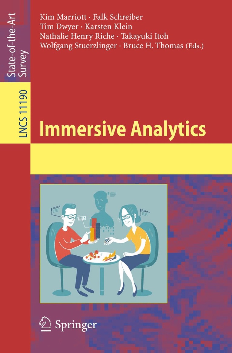
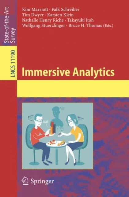
Immersive Analytics
Av Kim Marriott, Falk Schreiber m. fl.
Häftad, 2018
961 kr
Lägg i varukorg
Immersive Analytics is a new research initiative that aims to remove barriers between people, their data and the tools they use for analysis and decision making. Here the aims of immersive analytics research are clarified, its opportunities and historical context, as well as providing a broad …
Immersive Analytics
Av Bruce H. Thomas, Wolfgang Stuerzlinger m. fl.
E-bok, 2018
1224 kr
Lägg i varukorg
Immersive Analytics is a new research initiative that aims to remove barriers between people, their data and the tools they use for analysis and decision making. Here the aims of immersive analytics research are clarified, its opportunities and historical context, as well as providing a broad …
Diagrammatic Representation and Inference
Third International Conference, Diagrams 2004, Cambridge, UK, March 22-24, 2004, Proceedings
Av Alan Blackwell, Kim Marriott m. fl.
Häftad, 2004
568 kr
Lägg i varukorg
Although diagrammatic representations have been a feature of human com- nication from early history, recent advances in printing and electronic media technologyhaveintroducedincreasinglysophisticatedvisualrepresentationsinto everydaylife. We need to improve our understanding of the role of …
Diagrammatic Representation and Inference
Third International Conference, Diagrams 2004, Cambridge, UK, March 22-24, 2004, Proceedings
Av Atsushi Shimojima, Kim Marriott m. fl.
E-bok, 2004
739 kr
Lägg i varukorg