• Fri frakt över 249 kr
  • •
  • Snabba leveranser
  • •
  • Billiga böcker
Kundservice

Du är på sajten för privatpersoner.

Företag, bibliotek eller offentlig verksamhet?

Du handlar på classic.bokus.com, där alla dina funktioner finns intakta.
Till classic.bokus.com
Bokus logotyp. Gå till startsidan.
  • Erbjudanden
  • Student
  • Topplistor
  • Barn & ungdom
  • Bokus Play
  • E-böcker
  • Ljudböcker
  • Pocketböcker
  • Spel och pussel

5% studentrabatt – använd koden KURSBOK27 →

Sidfot

Mina sidor

    Hjälp

    • Kundservice
    • Vanliga frågor och svar
    • Frakt och leverans
    • Retur vid ångerrätt
    • Reklamera vara
    • Betalning
    • Köpvillkor
    • Allmänna villkor
    • Information om webbplatsens tillgänglighet

    Om Bokus

    • Om oss
    • Pressrum
    • För studenter
    • För företag
    • För bibliotek och offentlig verksamhet
    • För leverantörer
    • Hållbarhet

    Populärt

    • Aktuella erbjudanden
    • Presentkort
    • Studentlitteratur
    • Nya böcker
    • Topplistor
    • Signerade böcker
    • Engelska böcker

    Inspiration

    • Boktips
    • BookTok
    • Barnbokskaraktärer
    • Populära författare
    Logotyp för Bokus
    Följ oss på Facebook (extern länk)Följ oss på Instagram (extern länk)Följ oss på YouTube (extern länk)Följ oss på TikTok (extern länk)
    bokus @ CookiesAnpassa cookiesIntegritetspolicyKöpvillkor
    Till Citymail hemsida (extern länk)Till Budbee hemsida (extern länk)Till Postnord hemsida (extern länk)Till Schenker hemsida (extern länk)Till Early Bird hemsida (extern länk)Till Walleys hemsida (extern länk)
    1. Samhälle och politik
    2. Samhälle och kultur
    3. Kultur och medier
    4. Referensverk och tvärvetenskap

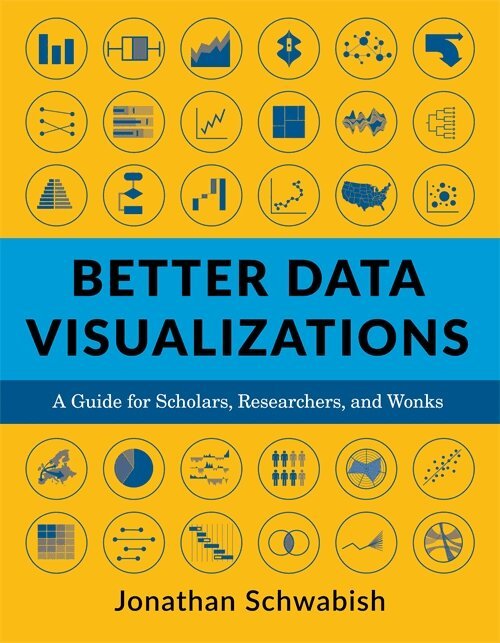
    Better Data Visualizations

    A Guide for Scholars, Researchers, and Wonks

    AvJonathan Schwabish

    Häftad, Engelska, 2021

    304 kr

    Beställningsvara. Skickas inom 5-8 vardagar. Fri frakt över 249 kr.

    Beskrivning

    Now more than ever, content must be visual if it is to travel far. Readers everywhere are overwhelmed with a flow of data, news, and text. Visuals can cut through the noise and make it easier for readers to recognize and recall information. Yet many researchers were never taught how to present their work visually. This book details essential strategies to create more effective data visualizations. Jonathan Schwabish walks readers through the steps of creating better graphs and how to move beyond simple line, bar, and pie charts. Through more than five hundred examples, he demonstrates the do’s and don’ts of data visualization, the principles of visual perception, and how to make subjective style decisions around a chart’s design. Schwabish surveys more than eighty visualization types, from histograms to horizon charts, ridgeline plots to choropleth maps, and explains how each has its place in the visual toolkit. It might seem intimidating, but everyone can learn how to create compelling, effective data visualizations. This book will guide you as you define your audience and goals, choose the graph that best fits for your data, and clearly communicate your message.

    Produktinformation

    • Utgivningsdatum:2021-02-09
    • Mått:178 x 229 x 31 mm
    • Vikt:1 162 g
    • Format:Häftad
    • Språk:Engelska
    • Antal sidor:464
    • Förlag:Columbia University Press
    • ISBN:9780231193115

    Utforska kategorier

    • Referensverk och tvärvetenskap inom Samhälle och politik

    Mer om författaren

    Jonathan Schwabish is an economist and writer, teacher, and creator of policy-relevant data visualizations. He helps nonprofits, research institutions, and governments at all levels improve how they communicate their work and findings to their colleagues, partners, clients, and constituents. He is the author of Better Presentations: A Guide for Scholars, Researchers, and Wonks (Columbia, 2016).

    Recensioner i media

    An excellent primer for anyone who wants to display quantitative information clearly and powerfully.

    Innehållsförteckning

    • IntroductionPart I: Principles of Data Visualization1. Visual Processing and Perceptual Rankings2. Five Guidelines for Better Data Visualizations3. Form and FunctionPart II: Chart Types4. Comparing Categories5. Time6. Distribution7. Geospatial8. Relationship9. Part-to-Whole10. Qualitative11. TablesPart III: Designing and Redesigning Your Visual12. Developing a Data Visualization Style Guide13. RedesignsConclusionAppendix 1. Data Visualization ToolsAppendix 2. Further Reading and ResourcesAcknowledgmentsReferencesIndex